Focal Range and why Smashing Magazine’s Homepage Design is Objectively Bad
Smashing Magazine inspired me to write this article. For those who are not familiar with it, it’s a magazine style online publication aimed at designers and developers. Before I start bashing it, I want to get this on the record: I like Smashing Magazine. I also really respect the designer behind it. But I don’t think it’s fit for purpose. I write this as a frustrated reader. The design choices make it hard to enjoy their content, and I’m not talking about the colour or typefaces, which I can live with. I’m going to explain what I think is wrong with the design. To do that I’ll need to introduce a couple of concepts…
How we see
We only see detail and colour in a very small part of our field of vision - right where we focus our gaze. I’m no biologist so I’ll keep this brief, we have two types of cells in our eyes that allow us to see; rods and cones.
- Rods - are not great when it comes to colour and definition.
- Cones - are made for colour and high definition
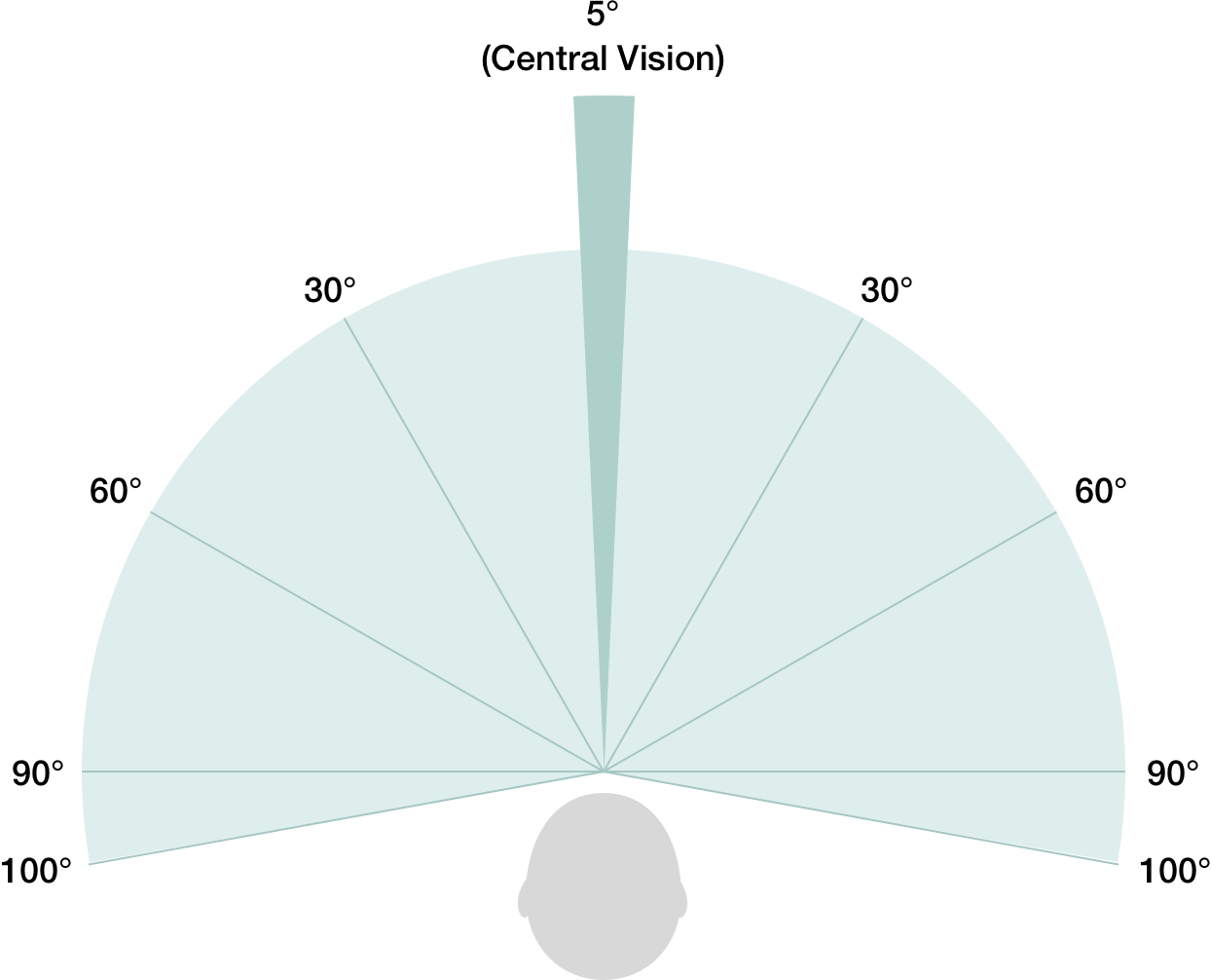
Most of our vision comes from rods. But right at the back of our eye there’s something called the fovea, which is where our cones are, and it’s only in this small area of our eye that we perceive detail. This graphic shows the distribution of rods and cones on the back of our eyes:
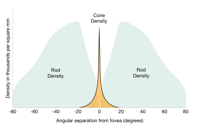
This distribution of cones means that we only perceive detail in about 1% of our entire field of vision, that’s tiny! If you hold your thumb up at arms length, it’s just the size of two thumbnails.
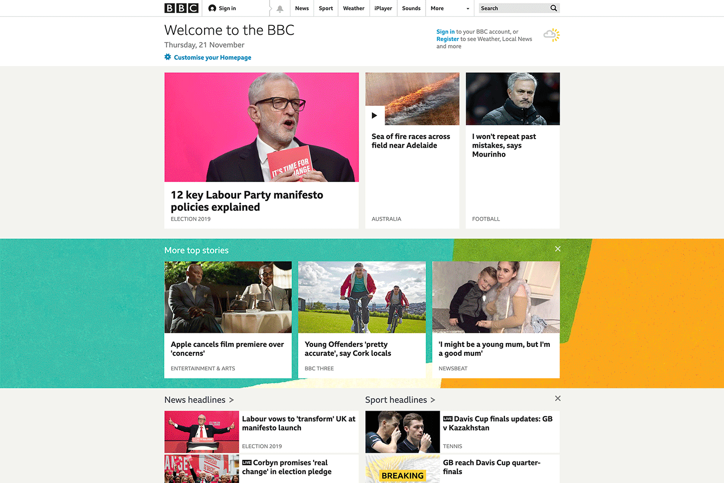
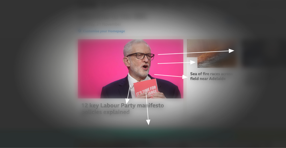
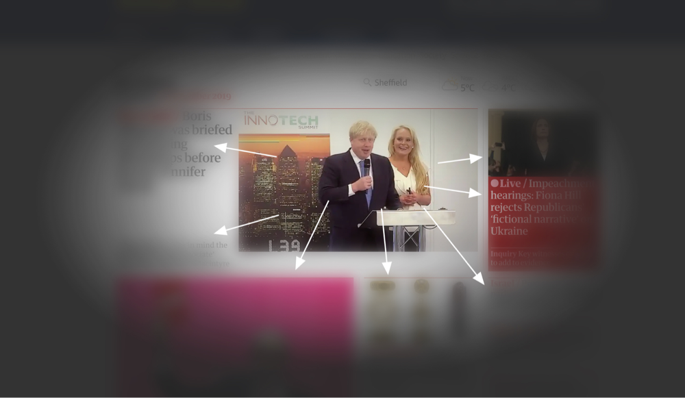
The rest of our vision is mostly for detecting contrast, movement and limited colour. It doesn’t feel this way because our brains are so damn good at fooling us, but it’s true. Here’s the BBC website along with a representation of how we actually see it when focussing in one place:
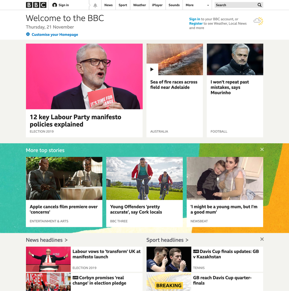
This is how we think we see it. But if you look Jeremy Corbyn in the eye (the guy in the top left), you’ll be aware that the article titles are there, but you won’t be able to read them. And you might be aware that the image on the right is a person, but you wouldn’t be able to identify The Special One (José Mourinho, come on you spurs!)
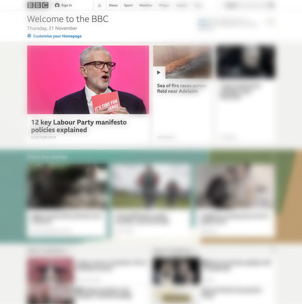
This is an approximation of how we actually see it. We see very little detail and reduced colour outside of our direct gaze. Now, you might think “that’s not how I see!”, and you’re right, it’s not exactly how we see, but for the purposes of being able to detect detail, this is an accurate illustration.
User Intent
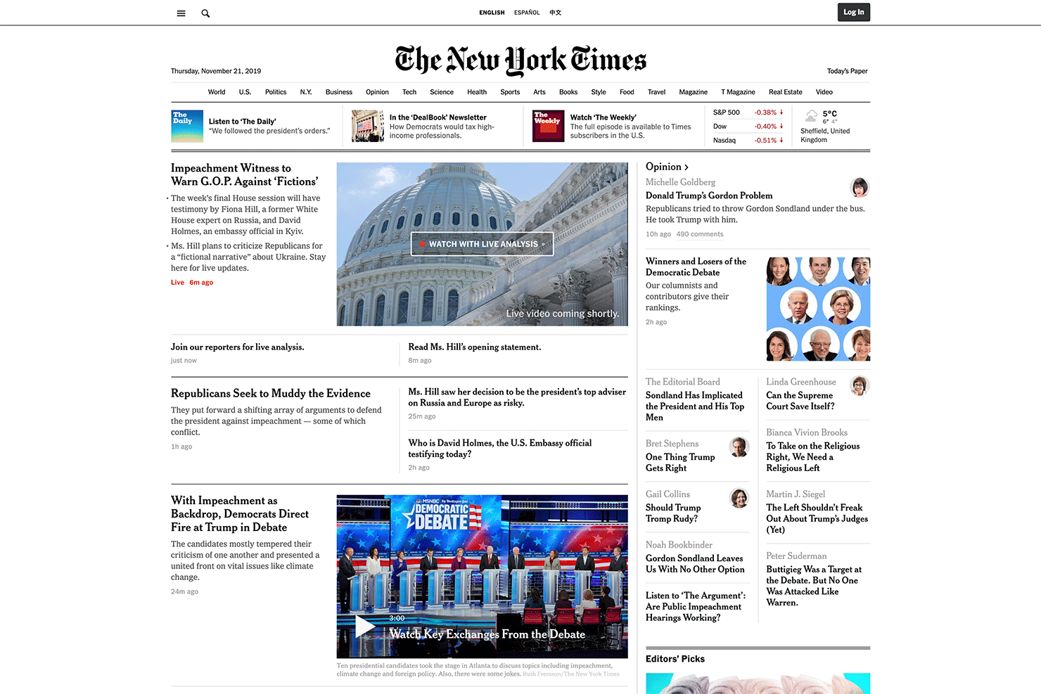
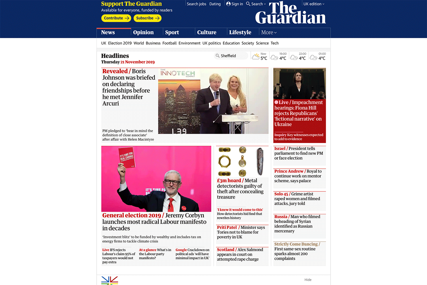
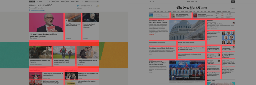
Putting the inner workings of the eye aside for a moment, let’s think about user intent and the role of a homepage in web design. But more specifically, the role of a homepage in a site that revolves around regular publishing of new content. Let’s look at three extremely successful publishing based (magazine/news) sites; the BBC, The Guardian, and The New York Times.
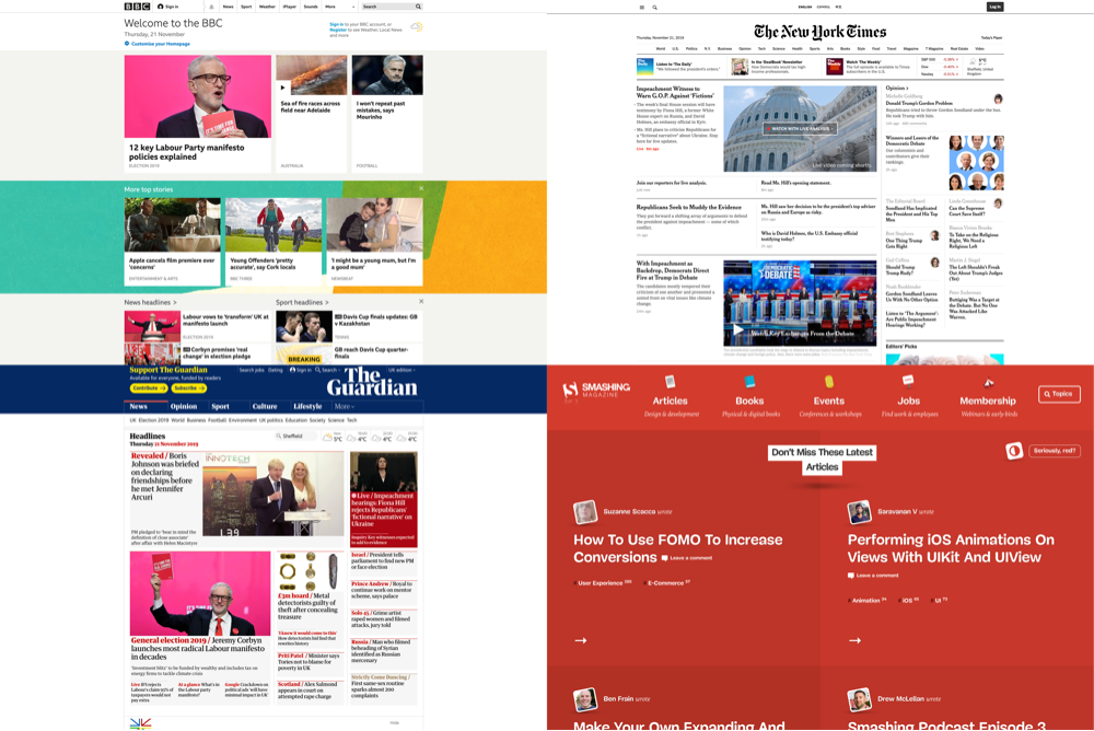
It’s safe to assume that these types of websites get a large proportion of return visitors, and that many visitors don’t enter via the homepage. Because of this, these homepages serve a different purpose to say a typical B2B service company homepage. These homepages have to be very navigationally functional. They have to serve as a browsing tool, helping users find new and important content. But browsing in this context is not just about being shown one article we like, it’s about quickly seeing what’s new and evaluating what’s most interesting to us, then making a selection from a range of options. This means being able to efficiently evaluate many content options. Users need to be able to effortlessly scan, and ideally be led around a layout, and mentally map what options exist where.
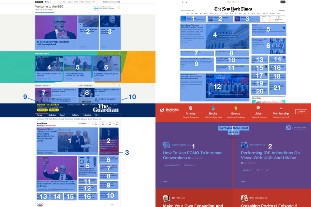
Take a look at these three sites adjusted for how we see:
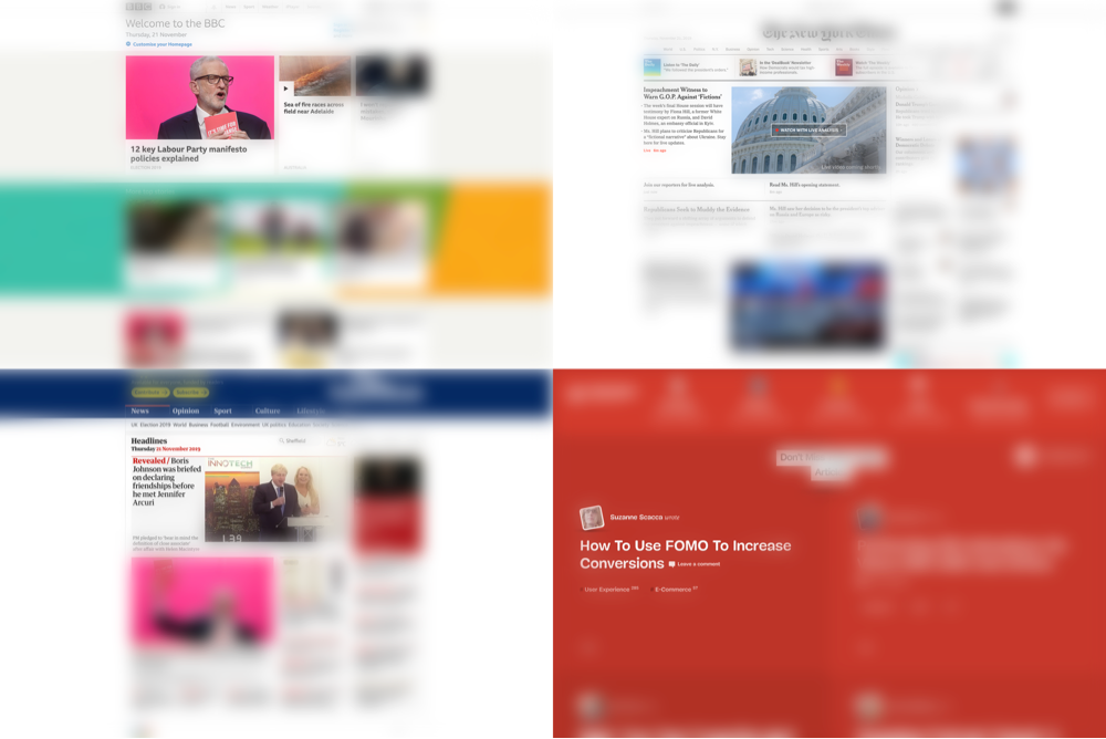
And here are versions showing how a user might explore what they see:
Some obvious features of all these designs share (with the exception of Smashing Magazine) are:
- They use images. You can see from the blurred versions, the images outside of the focal point are a huge peripheral draw when you take away detail and can’t read the words.
- Narrow layout. They use a narrow overall grid.
- Proximity. Not only is the grid narrow, but the content, columns and boxes within that grid are very close together.
But are these features improving or damaging the user’s experience?
- The lack of images in Smashing Magazine means you’re less distracted by the things you’re not focussing on, allowing you to clearly see and process the thing you are focussing on.
- The wide overall width allows for generous typography sizes, making things easy to read.
- The lack of proximity between neighbouring content items lets all the content breathe, allowing it all to be processed easily, without distraction.
On the part of Smashing Magazine, these must be deliberate choices, and I’d be willing to bet the reasoning was not a million miles away from what I’ve just described. But unfortunately, it doesn’t really play out this way in practice.
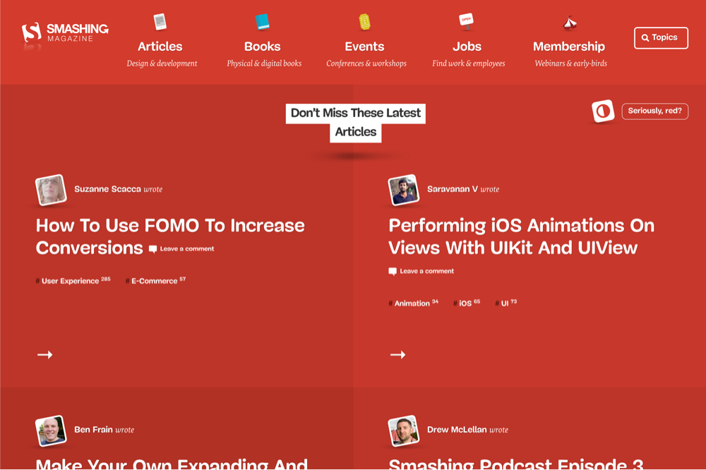
Smashing
Let’s have a closer look at Smashing Magazine. This is how it loads in the browser:
I’m going to explain how and why the choices outlined above, don’t work and actually make for a pretty bad user experience:
Number of content items onscreen
Let’s compare how many content items there are onscreen:
- The BBC: 10
- The New York Times: 21
- The Guardian: 16
- Smashing Mag: 2
Now, I’m certainly not one for stuffing content/links/marketing messages into a page design in general, but two content items doesn’t seem enough to give a feeling of choice. It means users to have to scroll, and this makes it difficult to build a mental map of the page and its content.
Lack of structure or ‘macro gravity’
If we crank the contrast on these homepages right up, we’ll see what items on the page are attention grabbing to our peripheral vision. This is how we interpret the page when we first glance at it. I’ve made basic ‘heat-mapped’ versions of the pages to show what attracts our attention… these are the large, high contrast items, generally things like large bold text, images, and background colour changes. What a design should be aiming for is to have clear attractors - things that ask for our attention. These attractors should be limited in number - too many will be confusing, too few will lack focus, there should be a hierarchy amongst them, and they should be positioned in a way that creates a balanced composition to give the user a natural route through the page. This is what I’m calling the ‘macro gravity’ of a page - it’s the gravitational pull an element on the page has on us based on how it presents to our peripheral vision.
You can see that the BBC, Guardian and NYTimes all do a good job of providing an interesting but balanced peripheral visual; by which I mean this ‘macro gravity’.
They have between two and six (ish, although there’s no magic number) high contrast page elements that control where we look. There aren’t too many high contrast elements, or too few, and their size and positioning create a comfortable ‘flow’.
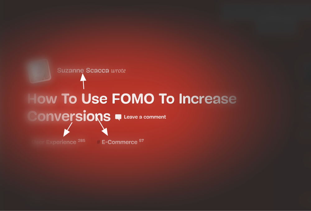
In comparison, if you look at Smashing Magazine the same way, it’s lacking this structure. There are no major gravitational attractors that ask for our attention. There are no images or significant background colour changes that require us to look at them, which results in a page that feels, well.. odd… without a natural flow or hierarchy, that’s difficult to process.
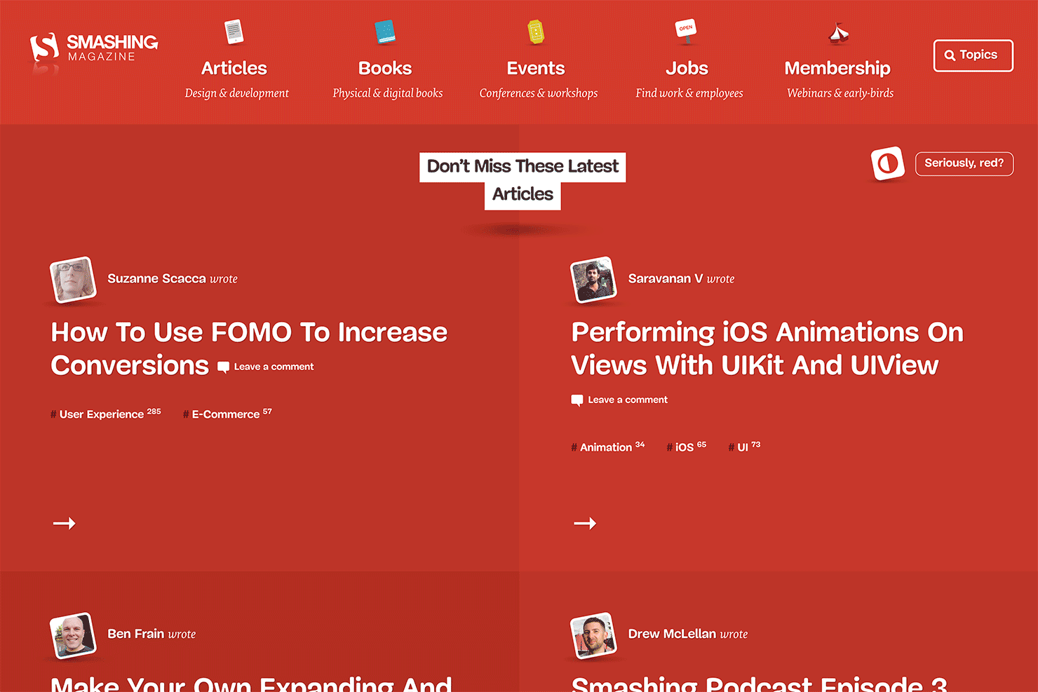
The most high contrast element on the page is the label ‘Don’t miss these latest articles’, which is not ideal.
No content proximity - or ‘local gravity’
Secondary to the ‘macro gravity’ is the ‘local gravity’.
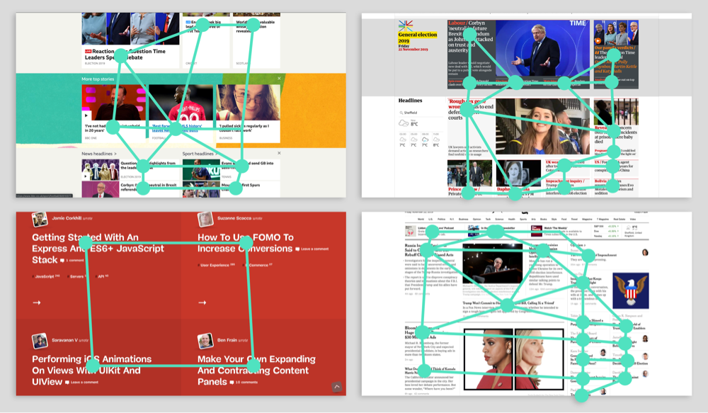
Take a look at the following graphics that show the relatively tight spacing between separate content elements in our successful designs. I don’t believe the tight spacing is just a creative choice; it serves a purpose, it affects the user’s journey through the page. Wherever our attention is focussed, having a close-by neighbouring item can provide an effortless next-item for our attention to go to. In layout terms we could call this ‘local gravity’. In terms of the overall user experience, it’s secondary to the ‘macro gravity’ described above, but comes into play after we’ve explored and adjusted to the page’s ‘macro gravity’.
When adjusted for how we see, we can see how the proximity of other content items can help lead the user:
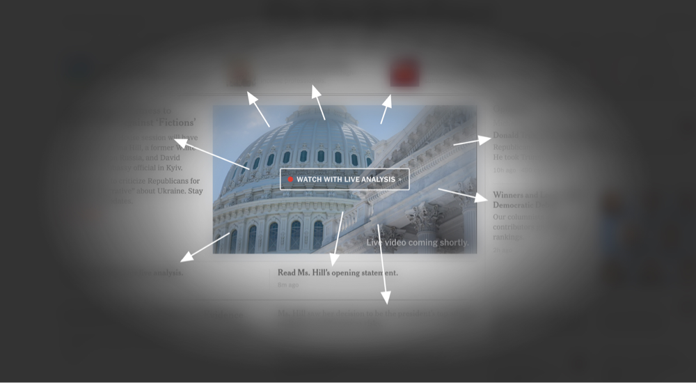
See how The BBC, Guardian and NYTimes all provide the user with an easy option for what to scan next. It allows the user to flow through the layout like water through a landscape: following the path of least resistance.
In this example however, the ‘local gravity’ offers very little pull, and where it does exist, it’s generally pulling the user to a secondary item such as author, comments, categories etc., rather than a primary item such as an article. Again, this interrupts flow and prevents an effortless user experience.
Spacing at the top
You’ll notice that the amount of space given to the site header is very large. The distance from the top of the page down to where the main site content (articles) begins is considerable:
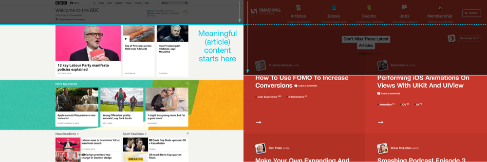
- Smashing: 580px
- The BBC: 250px
- The Guardian: 330px
- The New York Times: 290px
Same goes for the header size:
- Smashing: 214px
- The BBC: 163px
- The Guardian: 159px
- The New York Times: 177px
There’s far more real-estate on Smashing Magazine given to navigation, despite it requiring far fewer navigation items. And are the navigation icons and ‘explainer’ subtitles helpful or a hinderance? To me they’re a hinderance. This combined with the size of the page heading, means the actual thing readers want - the articles, are pushed right down the page.
Width and distances
There’s no maximum width so users get a fullscreen experience, and with the 2-column grid, each article has a full 50% width given to it - no gutters, no margins - so has a full 800x750px clickable area (roughly) at desktop sizes. Meaning just two articles take up almost a full desktop screen area. It also means the average distance between meaningful elements such as article titles is 700 pixels, that’s 2.1x that of the BBC, and 2.6x and 2.7x the NYTimes and Guardian respectively. Here’s a graphic of neighbouring content distances to show what I mean:
Don’t get me wrong, there are no set rules for things like this but it does help to analyse what’s wrong when you’re having a bad experience.
Strange click behaviour
The main articles are clickable across their entire backgrounds, which fill huge areas of the screen, and because of the generous spacing, your mouse can be in seemingly empty white-space, and a click would trigger a link that’s out of your focal range. This is made worse by the fact there’s no hover state on these huge article links.
In conclusion
It’s easy to be critical of other designers’ work, and I don’t do this to deride anyone.
But usability is important, and there’s no magic formula or universal rules. I’m deconstructing the issues primarily as a learning exercise for myself. This started because my instinct was that the design was not great, but I couldn’t articulate why beyond “it’s too big!”. So I wanted to explore and analyse why I felt that way. It’s also because I enjoy this type of discussion about design / layout / usability theory and deconstructed analysis, and I don’t really find any good content online about this kind of thing. So I thought I’d have a go at writing the kind of thing I would like to read. I certainly don’t expect my views to be accepted as fact or for everyone to agree with my theories and ideas.
I recognise that the scope of this is somewhat limited considering I’ve focussed on an above the fold desktop view of one page. I didn’t have time to dive into additional pages and responsive layouts etc. in so much detail. I also don’t have access to any Smashing Magazine analytics or performance data. It’s perfectly possible that the homepage performs brilliantly. All the points I’m making here are based on my experience as a reader and as much on my own theories about usability as they are 100% proven usability facts. So I’m totally open minded to the possibility that I’m wrong. And if you do agree with the points I’m making, please don’t think that I’m saying these are fixed principles that apply to all websites - I don’t think they are - to me, usability is not a formula.
Looking for advice? Talk to us today